












Is this yet another marketing ploy behind the new identity of Brussels Airlines? You might think so, given that the airline has just updated the visual appearance of its brand.
And yet.., this new identity allows the Belgian carrier to clearly identify with what it has become. "We went through a period of uncertainty when we didn't know whether we had become a low-cost airline or not. Or whether or not we were part of the Eurowings group within Lufthansa. All that is now clear, and our identity reflects who we are. And firmly," says a spokesperson for the Belgian airline.
Because yes, Brussels Airlines establishes itself as Belgium's national carrier. This identity follows the wishes expressed by the Belgian government, which came to the rescue of the carrier during the Covid-19 crisis. With the granting of a loan of 290 million euros in 2020, the government had insisted that Brussels Airlines should retain its role as the national airline. The new visual identity implicitly confirms this positioning.

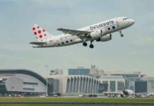
The 2021 brand identity features new shades of the red and blue colours characteristic of Brussels Airlines. The dotted "b" at the back of the aircraft has been replaced by 9 dots of different sizes in the shape of a square. They represent the diversity of customers, destinations and employees.
The art of being Belgian
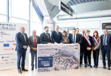
At the presentation on 18 November, Michel Moriaux, Marketing Director, Brussels Airlines detailed the philosophy behind this change.
"The new brand identity is a very logical step for Brussels Airlines. After years marked by so many changes, it was important to clarify and confirm our position in the market.. We are transforming ourselves into a new airline, with new cabin interiors, digitised processes, a renewed fleet and many other projects. Together with the Today agency, we have also created a more contemporary brand image for a reliable, modern airline. For a reliable and modern airline.
It would take a few years for the new identity to fully absorb the old one. Not least on the fuselage of the aircraft. The new livery will adorn the aircraft during a new painting cycle. "Normally every four years on average", says the company. The three Airbus A320Neo aircraft joining the fleet in 2023 will also wear the new livery..
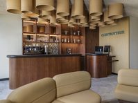
The interior of the cabins, recently reconfigured, will undergo few changes apart from the logo. Just like the Brussels airport counters or loungeswhich are already sporting the new visual identity. "It's the culmination of an effort to win back passengers through a more attentive service. It is the DNA of our company that is reflected in this logo. To be totally at the service of our customers and to embody the Belgian art of living", explains the company.